21 July 2009

America and Korea meet @ The Saatchi

On my summer gallery cruise I checked out the Abstract America: New Painting and Sculpture exhibition in Kings Road. The last time I was there I was trying out delicious food on the street food market and before that it was to check out the contemporary Middle Eastern Art exhibition. I really shouldn't critic what I don't know much of but I had to share this with you from the Saatchi site. This is absolutely hilarious - It was in the website under the reviews section.
A message to the artists included in Abstract America: Apologies for some of our art critics in the UK. A number of them know very little about contemporary art, obviously. But they do sometimes get there eventually, usually by the time the art is no longer very contemporary. 20 years ago they gave the thumbs-down to our Warhol, Judd, Twombly, Nauman, Guston, Marden exhibitions, that included many of their greatest works - if that's any consolation.


The top floor of the Saatchi featured Korean Contemporary Art for the first time on an international scale. They had some stunning pieces!


Sejima and Nishizawa @ The Serpentine

I am extremely grateful to have visited the last 4 architectural pavilions at the Serpentine Gallery. This time around architect duo Kazuyo Sejima and Ryue Nishizawa from SANAA embrace light and transparency with their design. Describing their structure the architects say:
‘The Pavilion is floating aluminium, drifting freely between the trees like smoke. The reflective canopy undulates across the site, expanding the park and sky. Its appearance changes according to the weather, allowing it to melt into the surroundings. It works as a field of activity with no walls, allowing uninterrupted view across the park and encouraging access from all sides. It is a sheltered extension of the park where people can read, relax and enjoy lovely summer days.’
Sejima and Nishizawa created a Pavilion that resembles a cloud or floating pool of water, sitting atop a series of columns. The metal roof structure varies in height, wrapping itself around the trees in the park, reaching up towards the sky and sweeping down almost to the ground in various places. The last two structures by Gehry and by Olafur Elliason and Kjetil Thorson were a litte more experimential+exciting and if I wanted uniterupted views of the park wouldn't I just walk in the park? It was a sweet pavilion but if you must visit also check out the Jeff Koon art inside the gallery.


Since 1909

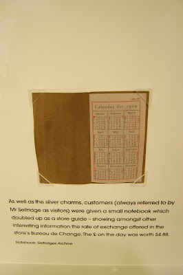
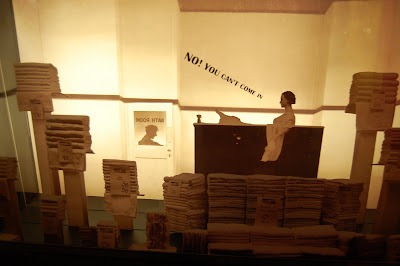
Not many shopaholics know this, but deep in the Selfridges basement a gallery of treasures lie celebrating Gordon Selfridges the man acclaimed as the creator of "the theater of retailing". Selfridges was always intended to be part store, part theater, part art exhibition gallery, and learning center but what it is for sure is the most beautiful department store in London. The exhibition tells the story of 100 years of Selfridges with information on the building architecture, window displays and the shopping experience. My personal fave bits from the gallery was the life sized Gordon made out of 200,000 lickable jellies, the iconic packaging of the bags tumbling from the ceiling, and the delicate photo montages laid on glass.